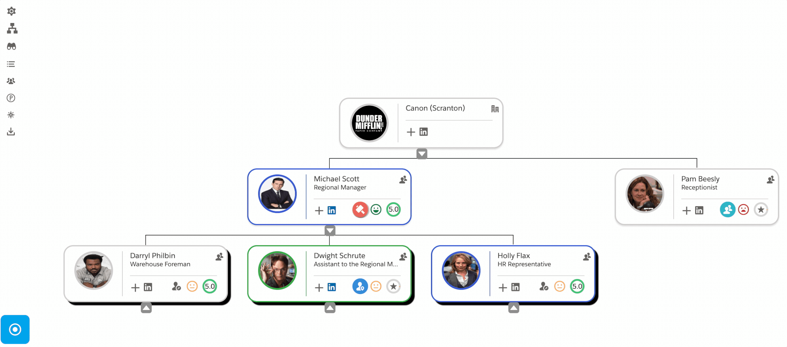
Org Charts and Relationship Maps in Salesforce
Visualizing your most important contact data in Salesforce offers several advantages, including:
Increased collaboration: Data visualizations can be easily shared and discussed among team members, facilitating collaboration and knowledge sharing. This can lead to better communication, understanding, and decision-making across the organization.
Actionable insights: Data visualizations can help users identify actionable insights that can be used to improve business processes, increase sales, and enhance customer satisfaction.
Enhanced user experience: Data visualizations can make Salesforce more user-friendly and engaging, especially for non-technical users. By providing a visual representation of data, users can quickly find the information they need without having to wade through text-based reports
Enhanced comprehension: Humans are naturally visual creatures, and we can process and understand information more quickly and effectively when it is presented visually. Data visualizations allow users to identify patterns, trends, and outliers that might be missed in traditional text-based reports.
Improved decision-making: Visualizations can help users make better decisions by providing a clear and concise overview of complex data. By seeing the data in a visual format, users can quickly identify key insights and make informed decisions based on evidence.
Org Chart and Relationship Maps in Salesforce can be used to gain valuable insights from Salesforce data. By using visualizations, businesses can improve decision-making, increase collaboration, and achieve better business outcomes.